Logo Design
As you know, the logo is quintessential to any business or organization. It is also one of my favorite design types to work on because of the deeper meanings conveyed through an icon and its heavy use of minimalism.
“Every great design begins with an even better story.”
-Lorinda Mamo
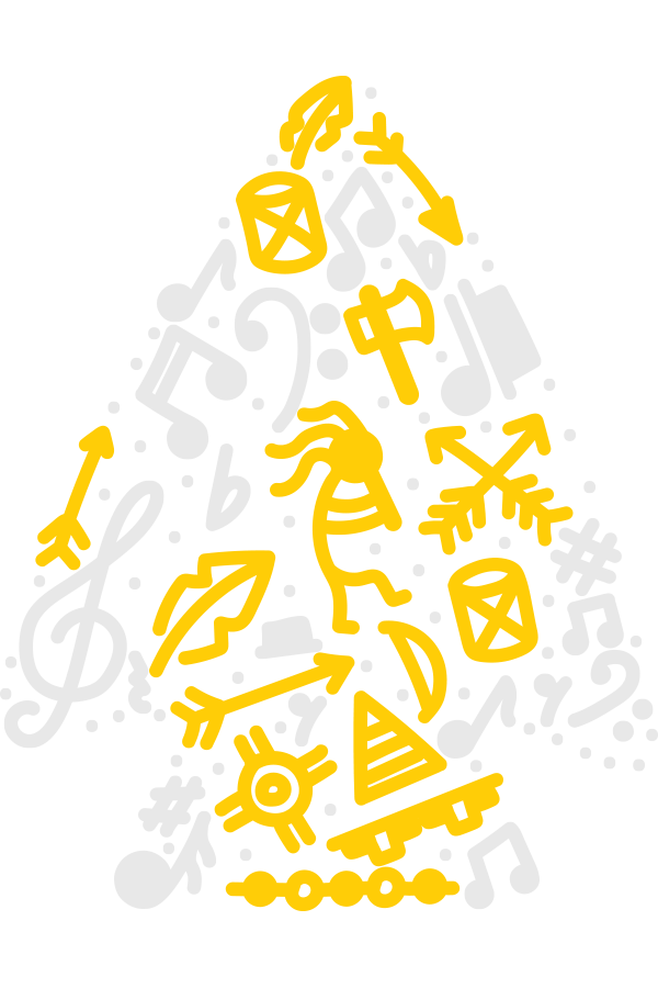
The Future Music Educators program from Tyler Junior College is an organization for students pursuing a career in music education, including elementary music, band, choir, orchestra, and more. The director of TJC’s esteemed band contacted me to design a logo for this program, hoping I could capture the idea and meaning of what it takes to pursue a career in music education while also tying into the college’s Apache roots and mascot.
Apache Symbolism
This logo features some very specific Apache Tribal Symbols that I felt were important to add to represent what it takes to become a Future Music Educator. Such as: “SkyBand,” meaning “Leading Towards Happiness,” “The Crossed Arrows,” meaning “Friendship,” “Kokopelli,” the Native American deity who represents the “Spirit of Music,” “Days and Nights,” representing the passage of time and the effort it takes, and the “Tepee” meaning the “Temporary Home” they find while at TJC.
Music Symbolism
While the symbolism for what it takes to become a Future Music Educator is essential, so are the symbols they use. This logo is also filled with musical notes and marks. Featuring Treble and Bass Clefs, Rests, Sharps, and more notes you may find on a music sheet.
Overall Symbolism
Overall, the logo represents an Arrowhead to symbolize strength and pushing ahead. While also keeping a more toned down and lively feel with hand-drawn elements, illustrating the drawings and symbols found in years past on parchments and cave walls, as well as the pictures you see in the margins of our notebooks and sheet music today.
The Tyler Civic Chorale has been integral to the Tyler, TX, musical landscape for over five decades. It aims to present a wide variety of choral music through high-quality performances for the enjoyment and education of East Texas audiences. Their director reached out to me to design a new logo that’s more modern and represents the choir and their home in Tyler, Texas.
The Rose
While the rose is often associated with expressing adoration and approval of performers during a performance, Tyler, Texas, also used to hold the title of “The Rose Capital of the World” and was responsible for a majority of the world rose exports, as well as hosting a variety of rose themed festivals and parades throughout the year. This was the perfect fit for the choir’s icon, as it represents the town and the choir’s distinct beauty in music.
The Music Within
I wanted to keep the focus of this logo on the rose rather than overbear it with commonly used musical elements, as I felt it would be unnecessary. However, I always love a good subtle nod and wanted to place it in the shading of the rose on the logo. The five lines in the emblem shading represent the five lines, or “Staff,” you would find on sheet music, adding a subtle touch of music within the rose, much like the choir is the touch of music within Tyler, TX.
A look behind the curtain.
Designing a logo is a tale as old as time, and I’m sure you’ve all heard countless versions of it. I start my logos as all great logos begin, on paper. First, I draw out multiple rough sketches to get my ideas out. Afterward, I select a few I like and take them into Procreate on my iPad. Next, I’ll refine those ideas and see what’s starting to work and what needs to be left behind. Those that continue will go into Illustrator on the Mac. From there, the final logo versions are designed and completed, awaiting the client’s approval.


