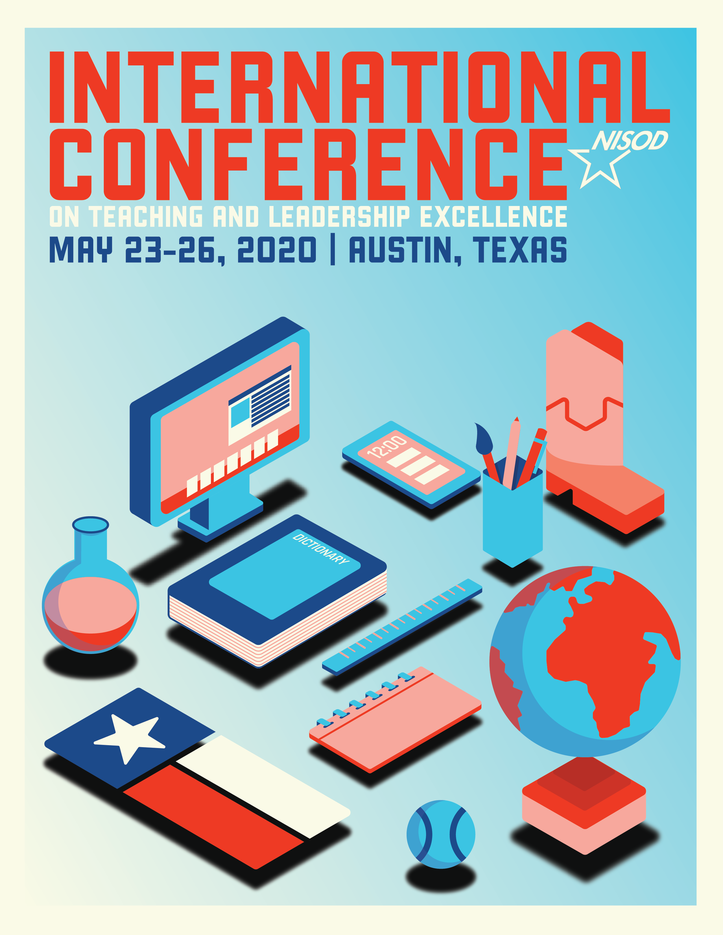
NISOD Cover 2020
Each year, the National Institute for Staff and Organizational Development (NISOD) hosts their Student Graphic Design Contest among NISOD-Member colleges to determine the artwork for next year's International Conference’s cover, poster, and overall branding. In 2019, I was selected as the winner of that year's contest and had my artwork used for the following year's conference.

Winning Design for the 2019 “International Conference on Teaching and Leadership Excellence” Cover & Branding by Cody Brenner
"Design can be art. Design can be aesthetics. Design is so simple, that's why it is so complicated."
-Paul Rand
“We’re in a new era of technology in teaching, and there’s a lot more than just books and paper now,” Brenner said. “So, I wanted to make sure to put that in as well because that’s where we are.”
When designing this cover, I had a few main goals in mind. The first is to better represent what Texas feels like because the past winners lived out of state. They felt more like what I was used to seeing in Arizona. The second thing was to represent technology better. Technology has shaped learning today as nothing else has, and it was integral to include this in the design. My last main goal was to do a type of design I had yet to do before, which turned out to be an isometric design. Isometric Design has become increasingly popular over the past couple of years and can be seen in many popular brands’ marketing. It’s fun and playful and tricks the eye into seeing things in 3D. It was an easy choice when deciding the direction for this cover design.
A look behind the curtain.
This design started in Procreate using an isometric grid as the guide for the artwork. My goal was to portray not only the idea of education that came before but to show the current and next state of learning. Technology has played a massive role in learning now, and I wanted to showcase that in this design after seeing that winning designs in the past neglected this part. After getting the rough sketch of the elements, I took it into Illustrator and redid the elements in vector. I adjusted the details to give them a more natural feel, then added color, gradients, and drop shadows. I also added the conference title, dates, and NISOD Logo.


