Printed Media
Whether it is posters, flyers, invitations, or more, printed design has been not only a timeless way to advertise but also the foundation of graphic design itself. Although printed media is being phased out in other mediums, there will always be a place for it in the world of graphic design and for those who love to see their work come to life.
“Creativity is allowing yourself to make mistakes. Art is knowing which ones to keep.”
-Scott Adams
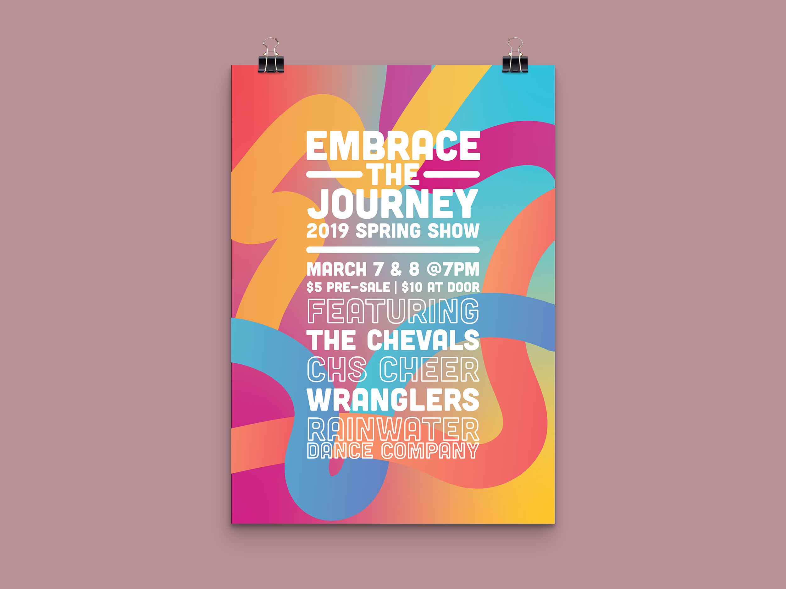
Spring Show Poster
Designed for the Creekview High School Chevals (Drill Team) and Cheerleaders Annual Spring Show. This poster was designed to represent multiple merging paths and roads on life's journey in a minimalistic way.

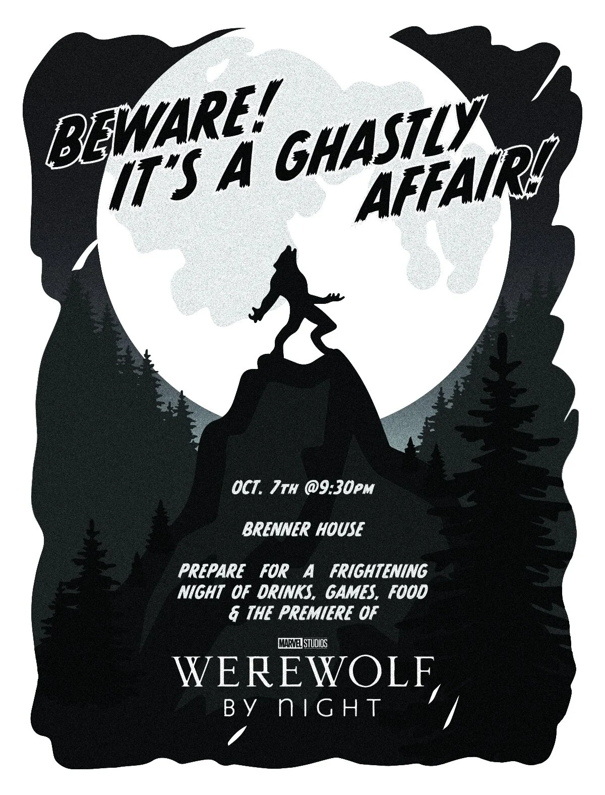
Halloween Invite
A personal invitation design for a Halloween party. The inspiration was from the evenings’ feature presentation, “Marvel Studios: Werewolf By Night.” Which draws heavy influence from classic horror films and noir style.

NISOD Cover 2021
Contest entry for the NISOD 2021 Cover. This design highlights Austin, Texas, the home of NISOD and the International Conference. This portrays not only the educational side of the conference but also the vibrancy and life of the city they know and love.

A look behind the curtain.
Spring Show Poster: This poster started with the strict idea that I did not want to do any cheesy “journey” imagery. Vehicles, roads, forked paths, etc., seemed too elementary. I tried to keep the idea there without being too on the nose. I chose this path (pun not intended) to keep things vibrant and lively. This poster version was designed in Illustrator completely and used very minimal sketching to complete it.
Halloween Invite: This invitation was primarily designed in Procreate and only taken to Illustrator to Image Trace the individual layers. I was okay with some of the defects the process may have brought because it could resemble minor printing errors from the time. After finalizing the colors, I added a film and grain effect in Photoshop to make it look more aged and time appropriate.
NISOD Cover 2021: This cover started with several small sketches done on paper. I then took them to Illustrator and traced them over with the pen tool. Next, I rearranged all the icons and added some small “filler” icons. Finally, I recolored the artwork and added the title and details to finish it.


